HTML Input Elements
Input in HTML
HTML documents provide a way for the user to input information while interacting with the webpage through HTML Form.
Form
This has various attributes like autocomplete, name, rel.
Also, there are various attributes for the submission of the form. These control behavior during form submission.
action: This will include the URL that will hold the address where the form data will be submitted.
method: The HTTP method to submit the form with. The only allowed methods/values are :
post: ThePOSTmethod; form data sent as the request body.get(default): TheGET; form data appended to theactionURL with a?separator. Use this method when the form has no side effects.dialog: When the form is inside a<dialog>, closes the dialog and throws a submit event on submission without submitting data or clearing the form.
novalidate: It indicates that the form shouldn't be validated when submitted. If this attribute is not set then the form is validated.
target: It specifies where to display the response after submitting.
<!-- GET METHOD -->
<form method="get">
  <label>Username:
    <input type="text" name="username" autocomplete="name" />
  </label>
  <button type="submit">Submit</button>
</form>

<!-- POST METHOD -->
<form method="post">
  <label>Username:
    <input type="text" name="username" autocomplete="name" />
  </label>
  <button type="submit">Submit</button>
</form>
The <input> (Form Input) element
It is one of the most complex in all of HTML as it has a huge number of combinations of input types and attributes. It is very powerful as it can let the user put their data inside the website and make them submit it to the database.
<input> types
The value of type attribute in the input decides what kind of task it will perform. The default attribute is text if in case it is not specified.
Some common <input> types:
<input type="text">
It is the default value with a single-line text field. The data is entered in the form of text. The value attribute is a string that contains the current value of the text entered into the text field.
Additional attributes include: list, maxlength, minlength, pattern, placeholder, readonly, size, spellcheck - false, true, ""(empty string or no value).
<input type="password">
It provides a secure way to enter a password for the user. It is a single-line plain text editor in which each character's text is replaced by an asterisk or a dot. The value attribute contains a string whose value is the current contents. If the user hasn't entered anything yet, this value is an empty string (""). If the required property is specified, then the password edit box must contain a value other than an empty string to be valid.
Additional attributes include: maxlength, minlength, pattern, placeholder, readonly, size.
<input type="file">
It lets the user choose one or more files from their device storage. Once chosen, the files can be uploaded to a server using form submission. A file input's value attribute contains a string that represents the path to the selected file(s). If no file is selected yet, the value is an empty string (""). When the user selected multiple files, the value represents the first file in the list of files they selected.
Additional attributes include: accept, capture, multiple.
<input type="search">
These are text fields designed for the user to enter search queries into. These are functionally identical to text inputs, but may be styled differently by the user agent. The value attribute contains a string representing the value contained in the search field. The value can be any text string or an empty string ("").
Additional attributes include: list, maxlength, minlength, pattern, placeholder, readonly, size, spellcheck - false, true, ""(empty string or no value).
<input type="email:>
These are used to let the user enter and edit an email address, or, if the multiple attribute is specified, a list of email addresses. The <input> element's value attribute contains a string that is automatically validated as conforming to email syntax. The common validated value formats include:
-- An empty string ("") indicates that the user did not enter a value or that the value was removed.
-- A single properly-formed email address. This doesn't necessarily mean the email address exists, but it is at least formatted correctly. In simple terms, this means username@domain or username@domain.tld.
-- If and only if the multiple attribute is specified, the value can be a list of properly-formed comma-separated email addresses.
Other input types are below in the table:
| Type | Description |
<input type="button"> | A push button with no default behavior displaying the value of the value attribute, empty by default. |
<input type="checkbox"> | A check box allowing single values to be selected/deselected. |
<input type="color"> | A control for specifying a color; opening a color picker when active in supporting browsers. |
<input type="date"> | A control for entering a date (year, month, and day, with no time). Opens a date picker or numeric wheels for year, month, and day when active in supporting browsers. |
<input type="datetime-local"> | A control for entering a date and time, with no time zone. Opens a date picker or numeric wheels for date- and time-components when active in supporting browsers. |
<input type="image"> | These are used to create graphical submit buttons, i.e. submit buttons that take the form of an image rather than text. |
<input type="month"> | It creates an input field that let the user enter a month and year allowing a month and year to be easily entered. The value is a string whose value is in the format "YYYY-MM", where YYYY is the four-digit year and MM is the month number. |
<input type="number"> | A control for entering a number. Displays a spinner and adds default validation. Displays a numeric keypad in some devices with dynamic keypads. |
<input type="radio"> | These are generally used in radio groups—collections of radio buttons describing a set of related options. Only one radio button in a given group can be selected at the same time. Radio buttons are typically rendered as small circles, which are filled or highlighted when selected. |
<input type="reset"> | A button that resets the contents of the form to default values. Not recommended. |
<input type="submit"> | A button that submits the form. |
<input type="range"> | A control for entering a number whose exact value is not important. Displays as a range widget defaulting to the middle value. Used in conjunction with min and max to define the range of acceptable values. |
<input type="url"> | A field for entering a URL. Looks like text input, but has validation parameters and relevant keyboard-supporting browsers and devices with dynamic keyboards. |
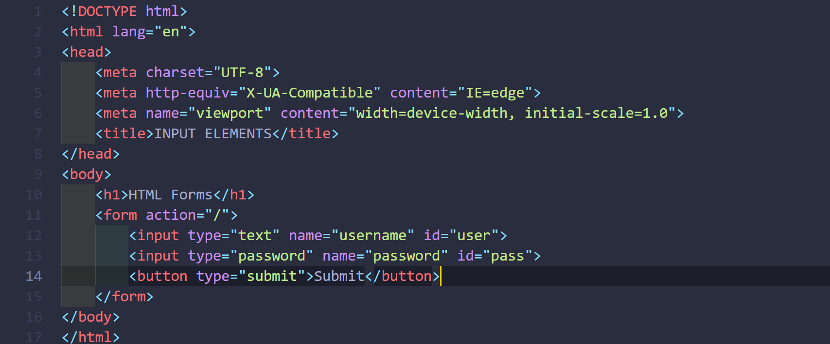
HTML FORM TEMPLATE
DISCUSSION
So, the input elements are used to let users interact and push the data they need. Various attributes can be used according to their properties which will give characteristics to the input elements. Moreover, using CSS and JavaScript, these characteristics and user experience can be enhanced while they are interacting. In the login section; form-filling sections in examination webpages; various data-requiring sections these form input elements are used.
Thank you for reading.